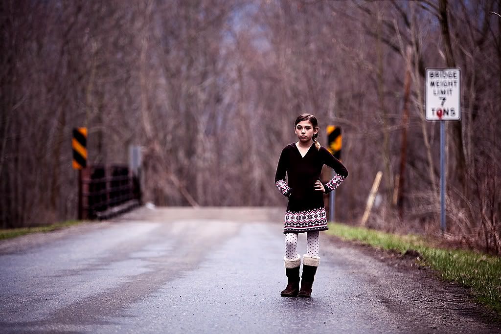
This week’s image is just gorgeous, so didn’t need much done to it to make it pop.
I added a variety of layers. First I cloned out the little bit of pink to the left of the yellow sign. I also found the bridge sign on the right to be a bit distracting, so I got rid of it. (I kept on trying to read it but the blur hurt my eyes a bit). I placed an unsharp mask layer to sharpen everything a little, then a levels layer just to bring out a bit more contrast by bringing the darks and lights in a bit. The colour balance layer was next, moving the greens a bit to the magenta.
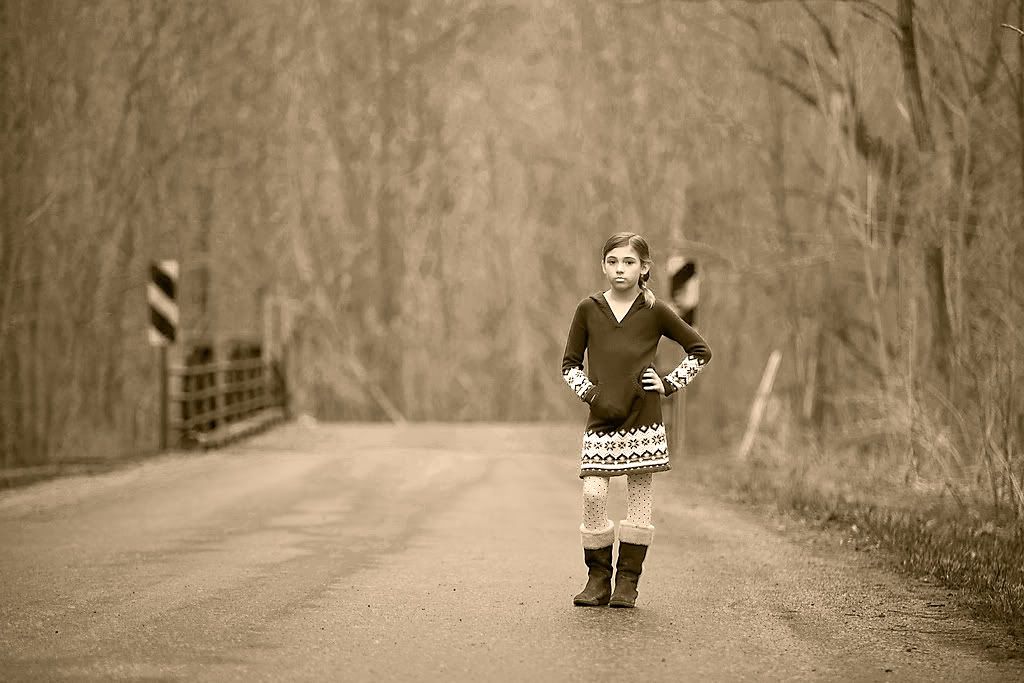
I used a black and white layer to create a monotone image (with a tint), then played a bit with the channel mixer to get the right kind of colour.
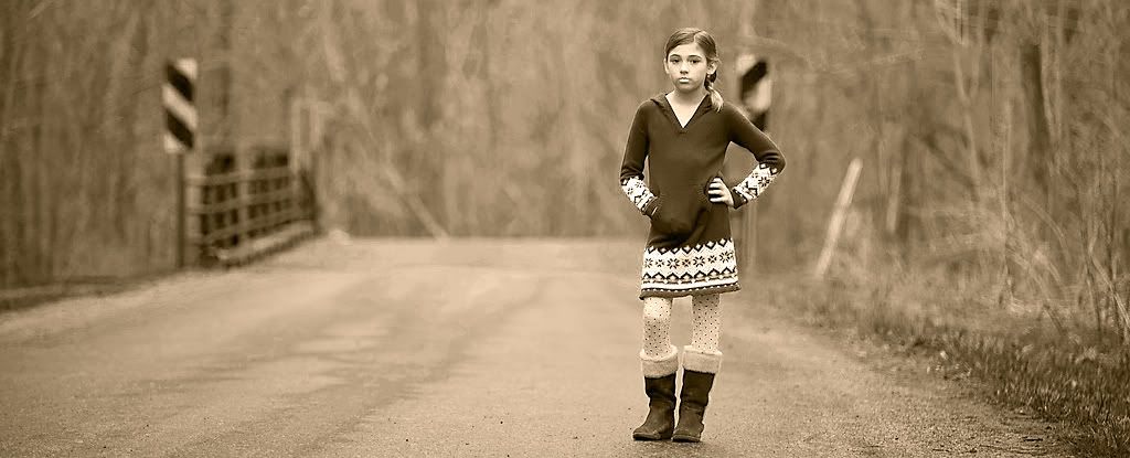
Lastly the crop, just to be different. Hope you like it! (Click on the image to see it larger)

(My Friday being nearly over, this has gone up a little earlier than the rest who are still sleeping on the other side of the world!)


I Likey ALOT!!! Well done my friend! I won't be able to play till this evening...
ReplyDeleteThanks! Yours is great too. Like the crop. Removing those yellow things made a big difference.
ReplyDelete